Disclaimer: The views and opinions expressed in this article are those of the author and do not necessarily reflect the official policy or position of any agency of the government bodies mentioned. Examples of design analysis performed within this article are only opinions. Assumptions made within the analysis are not reflective of the position of any government entity.
This article is intended to provide a broad overview of various government body website designs. The inclusion of any government body website in this article does not constitute an endorsement or opposition of any views or content of the website's owners by the author or by our publication.
Please be aware that this article contains external links. While we strive to provide only quality links to useful and ethical websites, we have no control over the content and nature of these sites. When you leave our website, other sites may have different privacy policies and terms.
Let's jump in, to some great design!
1. U.S. Department of State - Modern Classic Visual Lines
About the site
This website serves as the digital platform for the official entity that spearheads the United States' foreign policy. Its primary objective is to safeguard the interests and security of the American people on the global stage. By providing up-to-date information on the nation's diplomatic strategies, international partnerships, global initiatives, and key policy decisions, the website helps users understand America's presence in the global context.
Why I love this site's design
The U.S. Department of State's website balances a vast amount of constantly-changing information with a clean, easy-to-navigate interface.
With a visually appealing color scheme of blues and whites, with classic gold accents and serif header fonts, this site instills trust and stability.
The main navigation bar is straightforward and intuitive, making information easily accessible.
Visit the website
Screenshots

An example of useful and effective UI/UX, with a sans serif font, use of bold case, and icons. A dropdown explainer, providing details about how to verify an official website of the United States Government, for non-technical users.
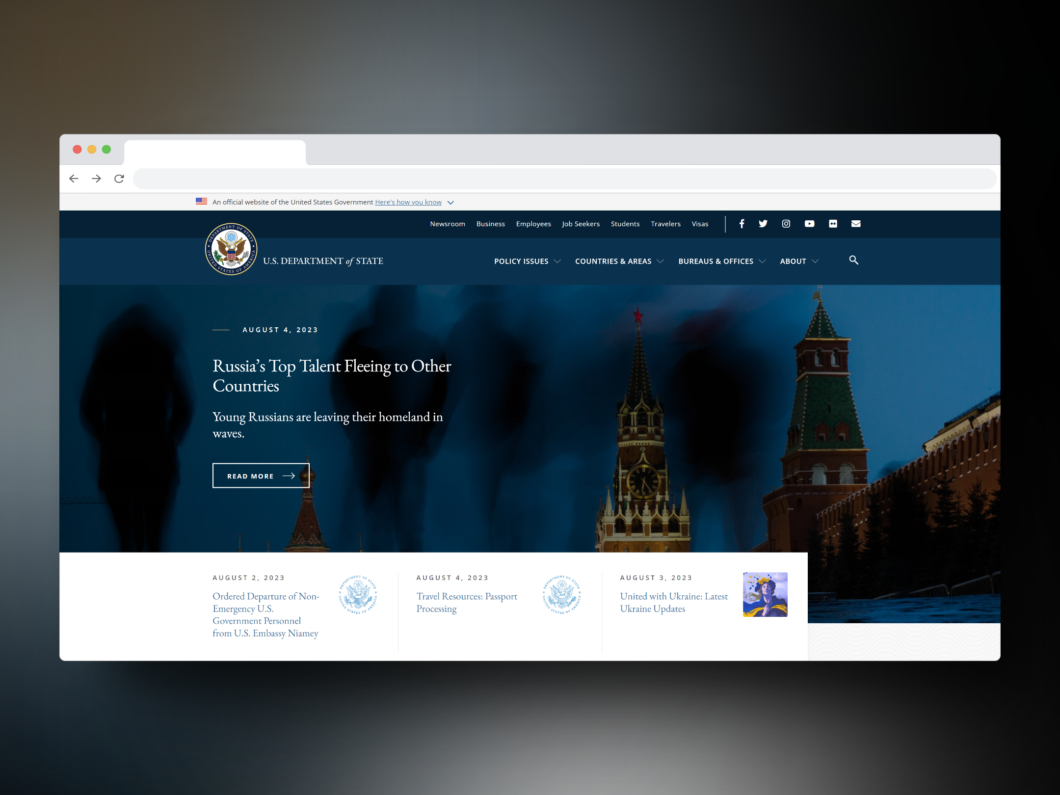
US Department of State Website
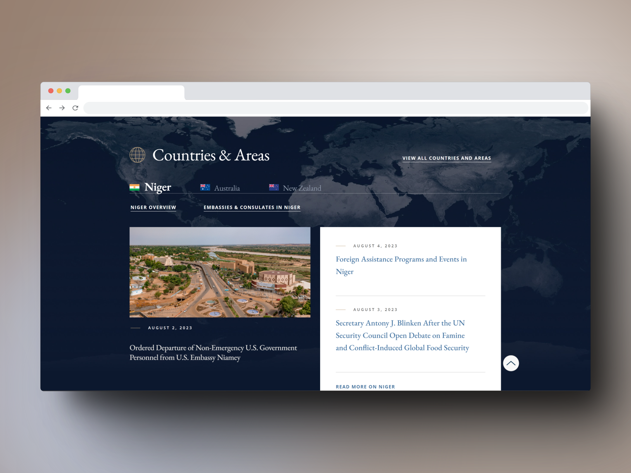
US Department of State Website
2. CIA World Factbook - Combining knowledge of Q and the style of James Bond
About the site
The CIA World Factbook provides a wealth of information in an efficient, user-friendly format. The website combines the simplicity of clean lines and straightforward layouts with an impressive array of data. Country profiles, maps, and flags are all quickly accessible, with interactive elements that make exploration easy and informative.
Why I love this site's design
Oh-kay CIA! We see you. Yes. The CIA has great style. Tastefully done where it's not too over the top, but it still has a certain, je ne sais quoi with its consistent visual styles.
I also appreciate a few creative use-cases within the site, like the "Apply for a job" feature, at the bottom of the website. I mean, only people interested in all things data, history, etc. would visit a site like this.
This website's aesthetic is almost like a sleek, stylized version of Encyclopedia Britannica, or Wikipedia, specifically for countries.
Visit the website
Screenshots
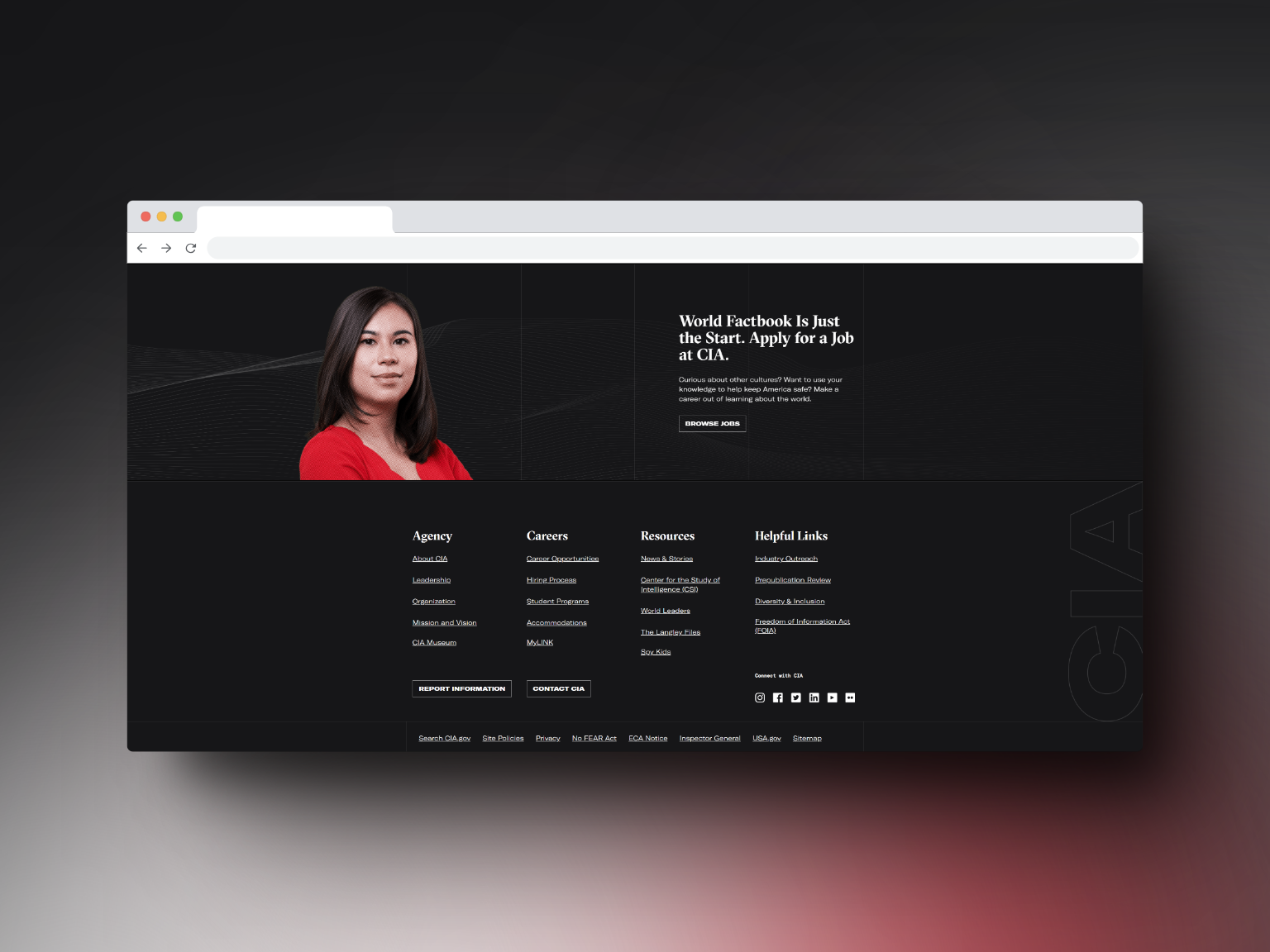
Never waste a space: adding an employment CTA (CTA means, "call to action") is a great use of a website's footer space!
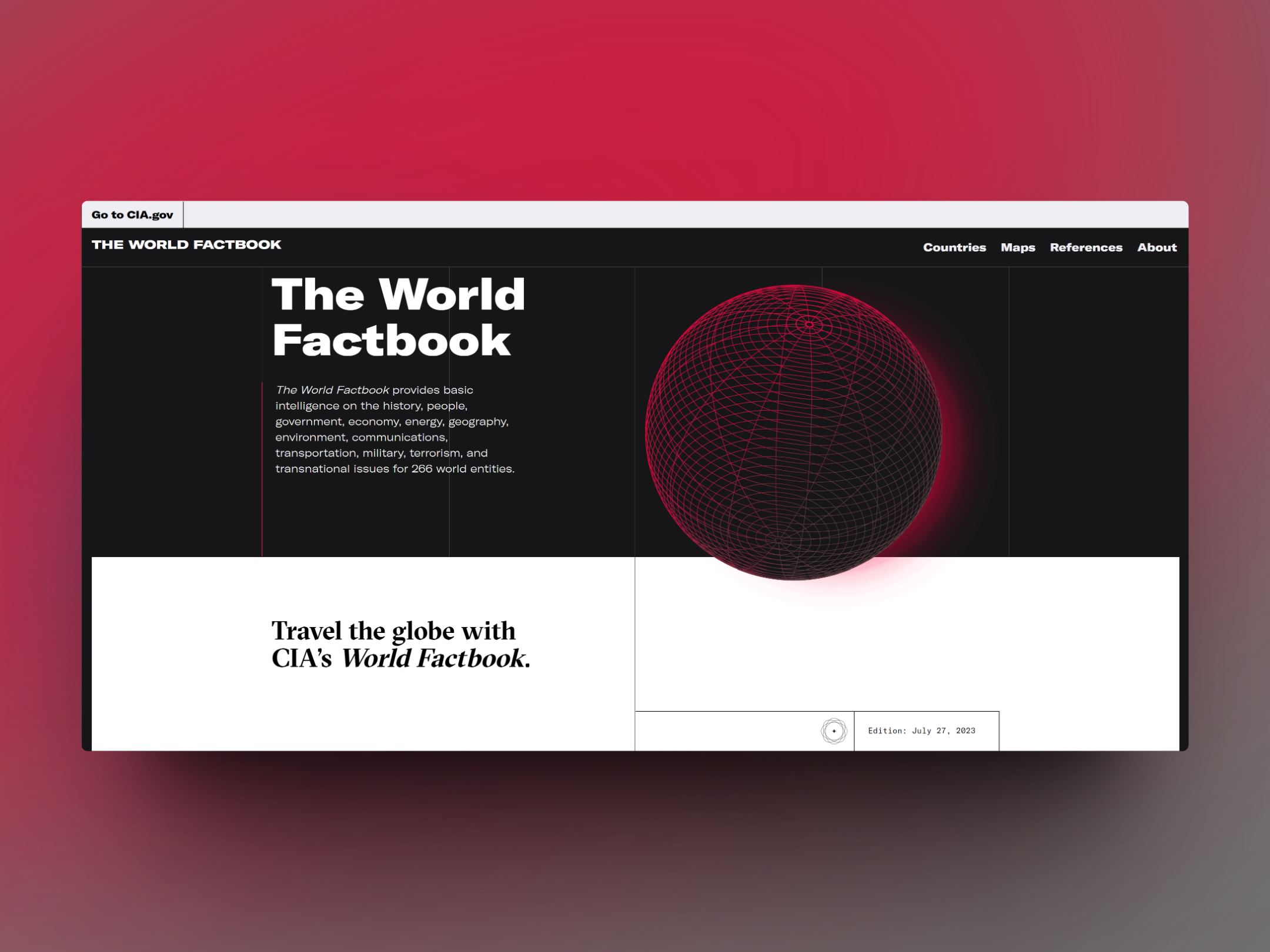
The CIA World Factbook Website
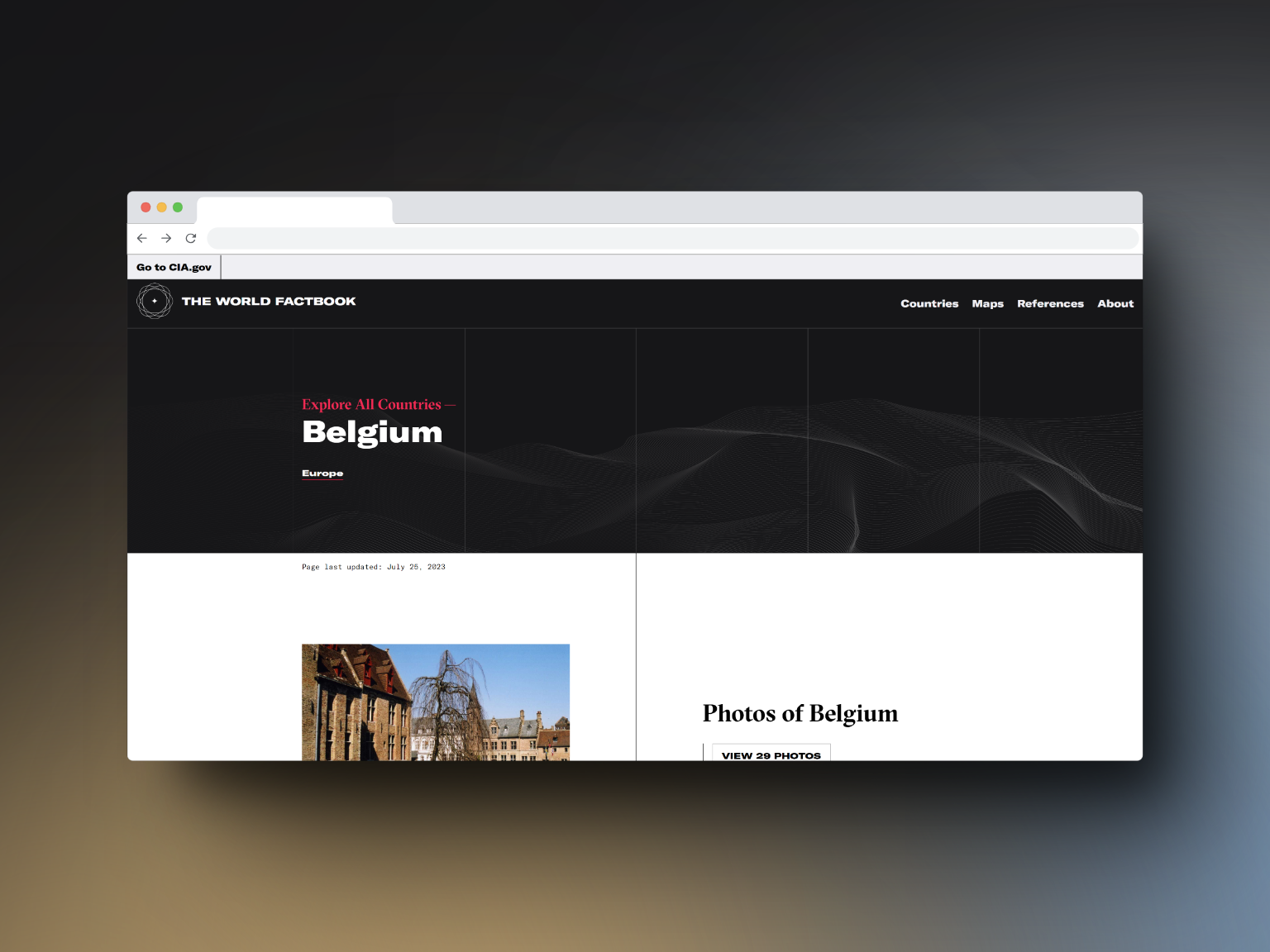
The CIA World Factbook Website
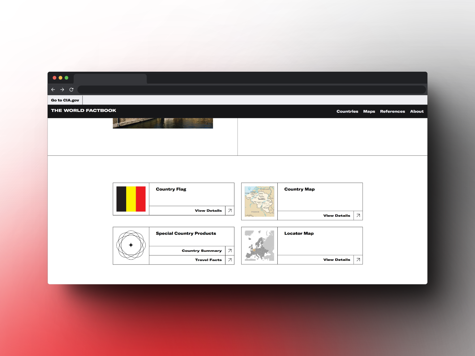
The CIA World Factbook Website
3. Discover Puerto Rico
About the Site
The official tourism website of Puerto Rico, this is your gateway to a Caribbean paradise with a vibrant blend of cultures, pristine beaches, and delectable food. Immerse yourself in our rich history and friendly local culture. Start planning your adventure and uncover the many treasures that await. Bienvenidos to Puerto Rico!
Why I love this site's design
I have so many nice things to say, that I'll have to direct my excitement into bullet points to make my thoughts fit:
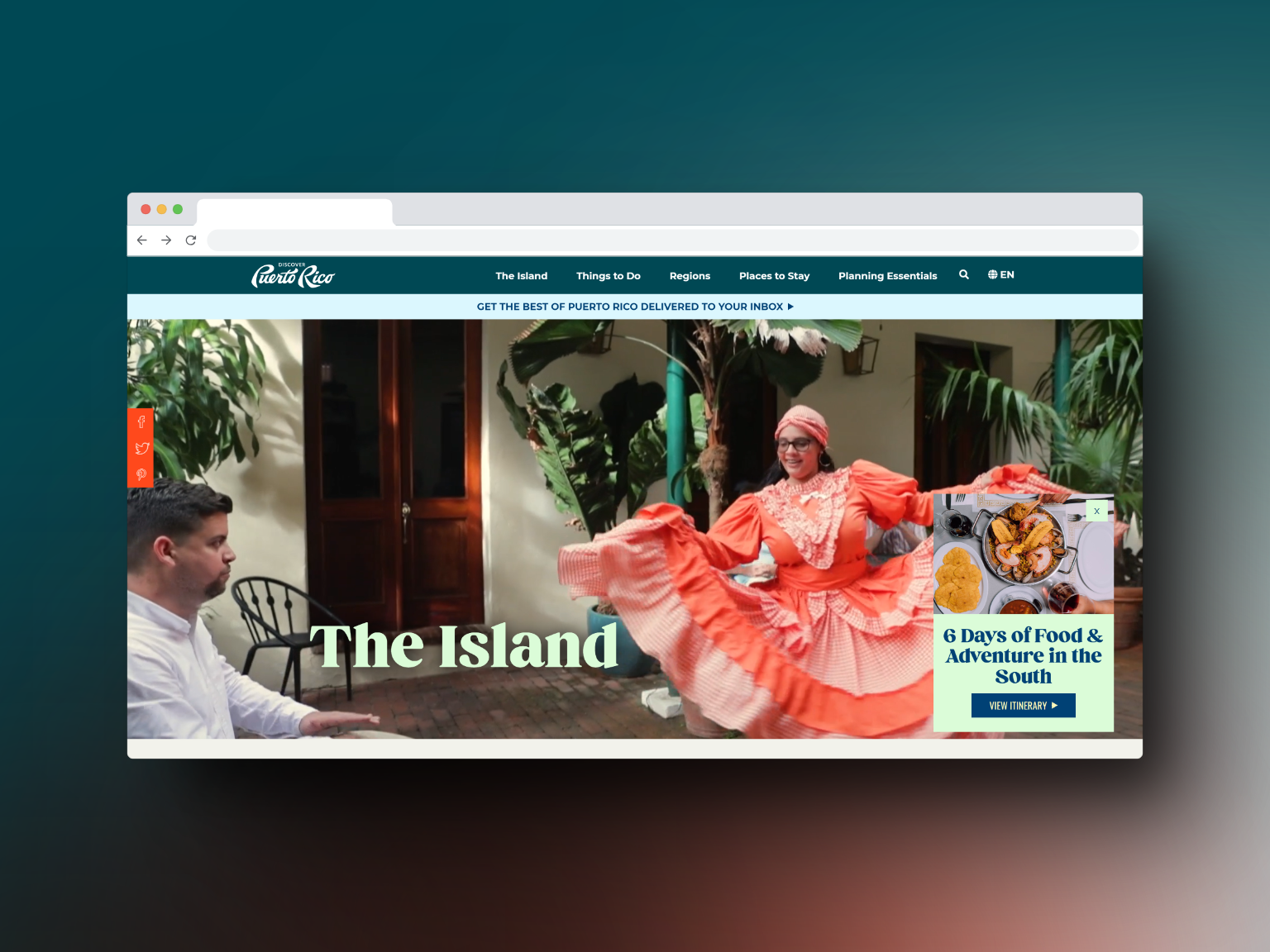
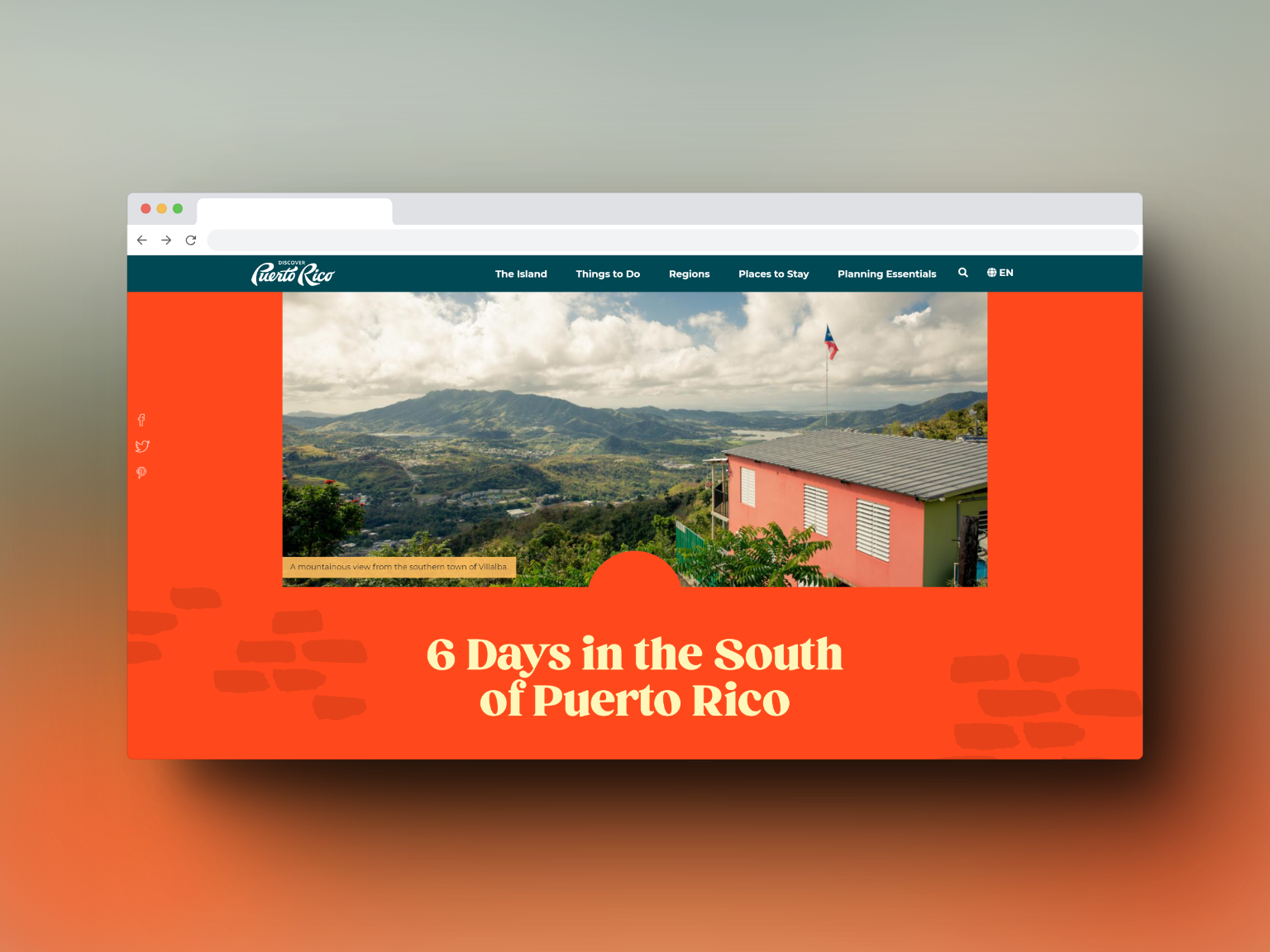
Vibrant colors, that not only evoke the right emotions, but are on-trend for the continued (yet less chaotic, from previous years) Gen-Z-ification of 2023's design landscape
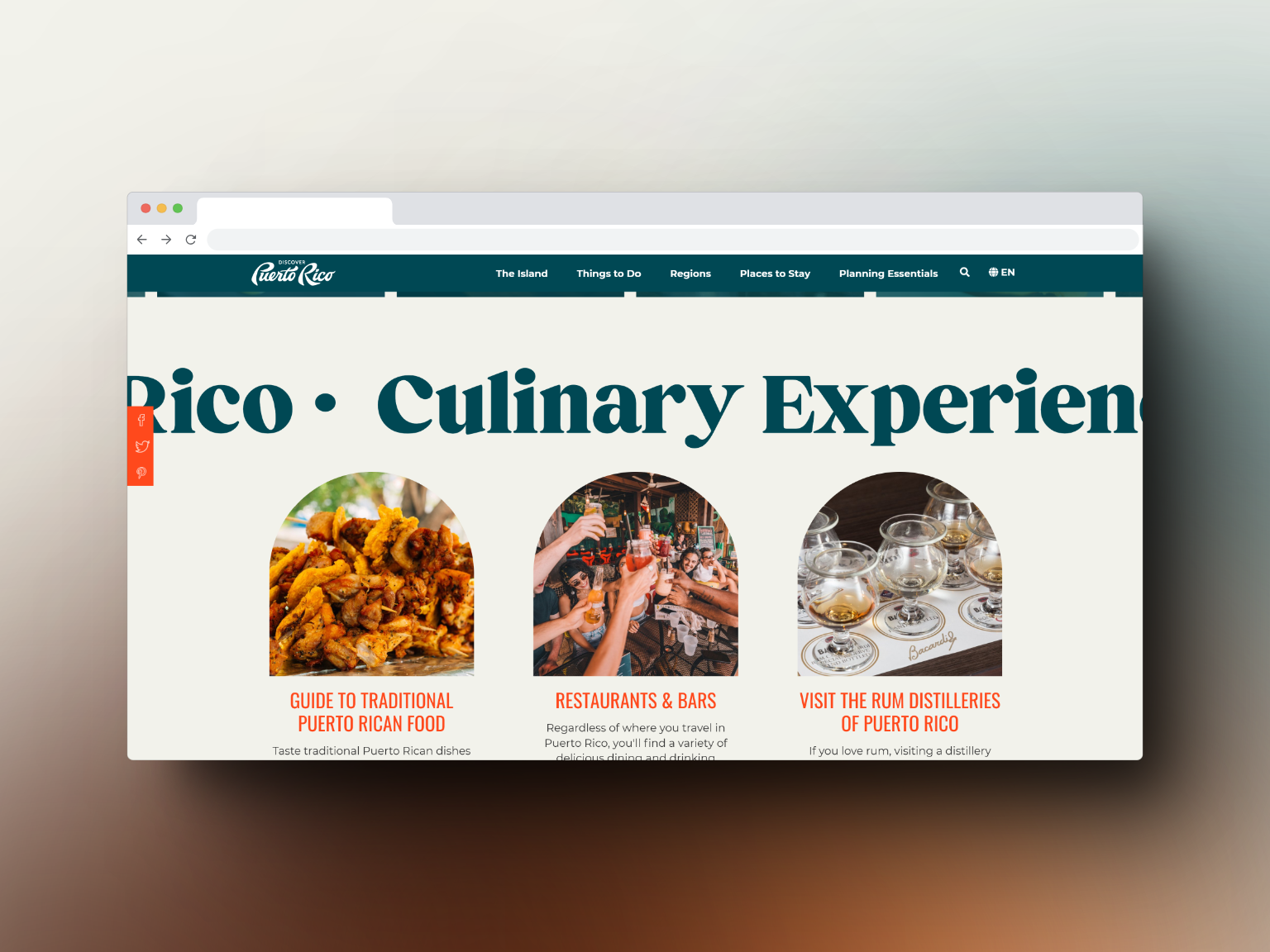
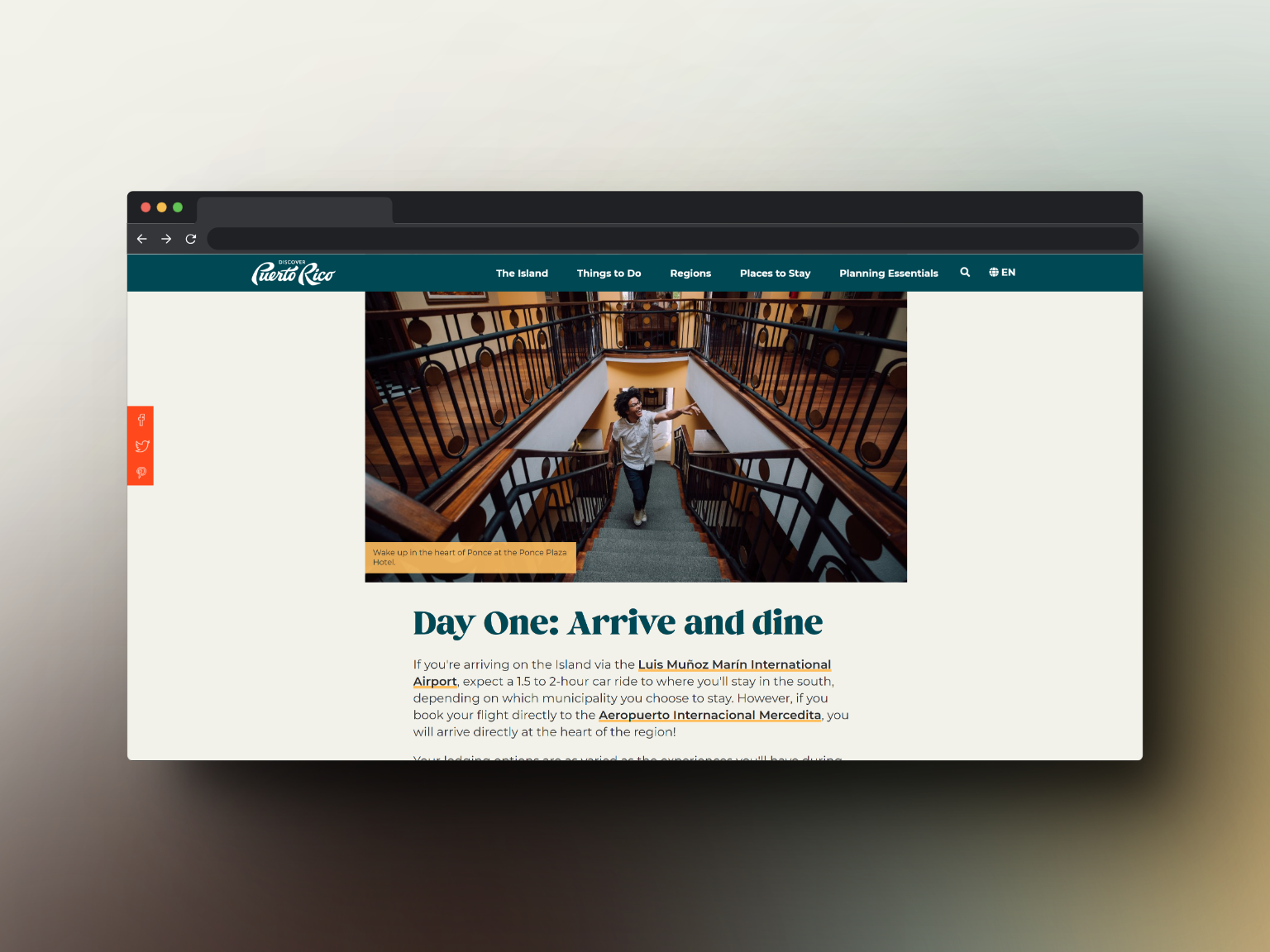
Typography choices are amazing. These expressive, well-rounded and chubby serif and sans serif fonts compliment the emotive color-palette. The size hierarchy is well-implemented
Great use of shapes, especially on-trend (2020-2023) ones
Placement of UI and elements is nice and varied with sizing
Use of background videos is one of my favorites, which this site utilizes expertly
Mobile version doesn't disappoint, nor does it suffer from the typical mobile design neglect that is common in web design
Their ad retargeting is on-point (screenshot below)! I was targeted with an ad on another website, shortly after visiting Puerto Rico's tourism site. The ad design was gorgeous, eye-catching, and matches their website.
Visit the website
Screenshots
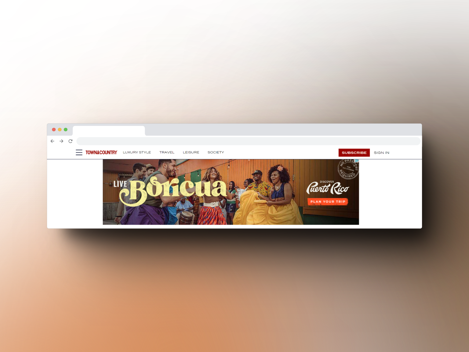
This is what it looks like when ad retargeting is on-brand.
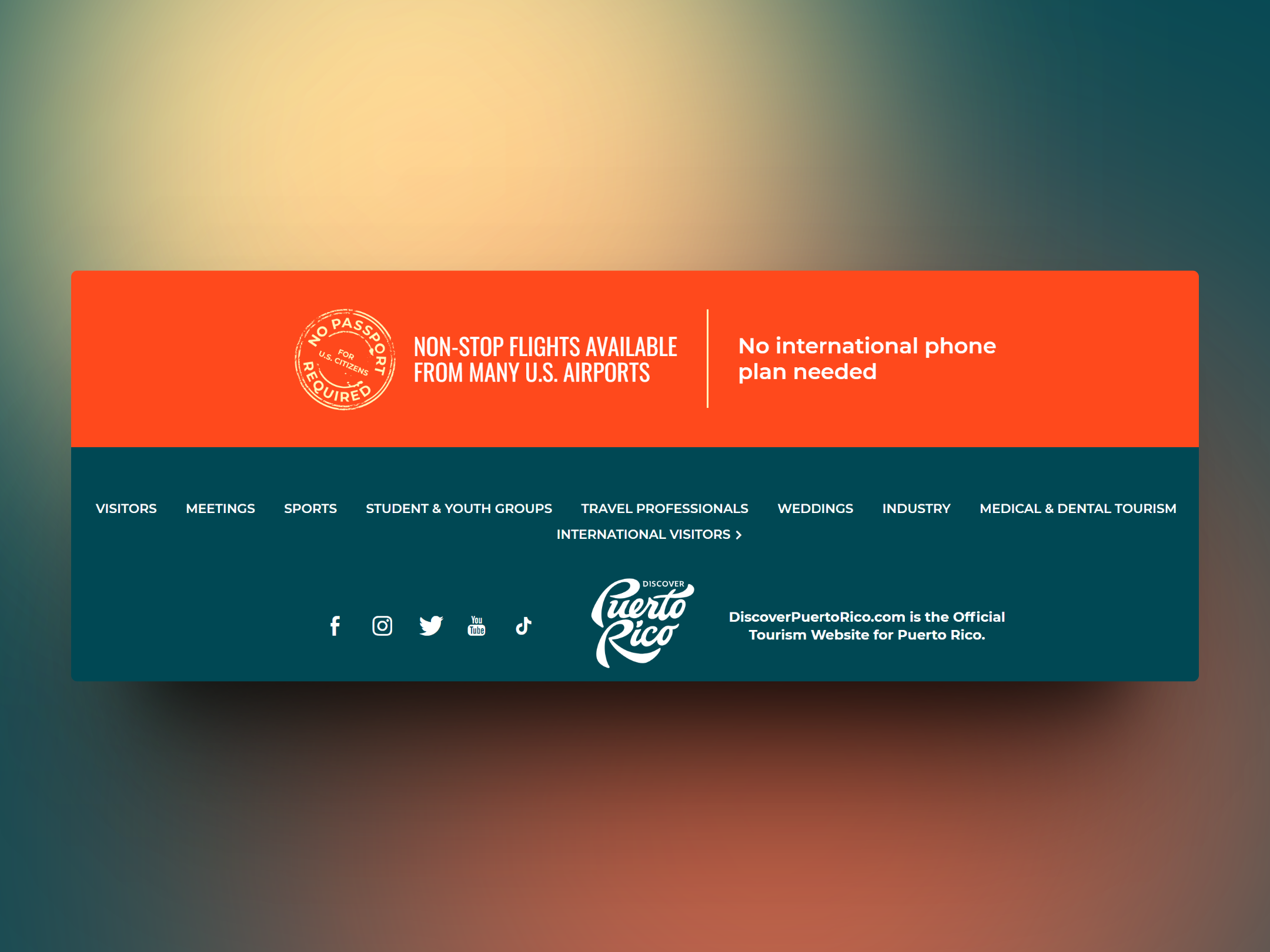
UX for the win! Footer concisely (and stylishly) covers many FAQs, search queries, travel professional resources, and even introduces tourism ideas/niches the user may not have thought of.
Discover Puerto Rico Website
Discover Puerto Rico Website
Discover Puerto Rico Website
Discover Puerto Rico Website
Enjoy the inspo!
These three websites show how government bodies can incorporate modern web design trends to deliver quality content in an accessible, user-friendly format.
From minimalism to maximalism, these design elements not only create an aesthetically pleasing website but also enhance user engagement and satisfaction.
Subscribe to the blog today for more design inspiration in my Web Design Lookbook series!
